The Blue Lineage has begun.
We are excited to release the first book in a new series called Lineage. The Lineage book series showcases artists in their work and daily environment. The photographic heavy publication will shed light on the artists process and way of life while producing a body of work. Utilizing snapshots, sketches, and snippets all mixed in with artworks in process. Once a book is complete, the artist then chooses the next artist in the series.

James Kirkpatrick - Lineage Edition - Blue #1
We have chosen James Kirkpatrick as the first artist in the Lineage series. Over the years we have had the pleasure of working with Kirkpatrick and have published a book and multiple zines ( Brain Trust and A Dog Named Dracula ). His experimental works in sculpture and circuit bending are the vein which connects the two vital organs in his creative endeavours, art and music. We are very happy to share a glimpse into the process of Kirkpatrick's life + work. View the Book.
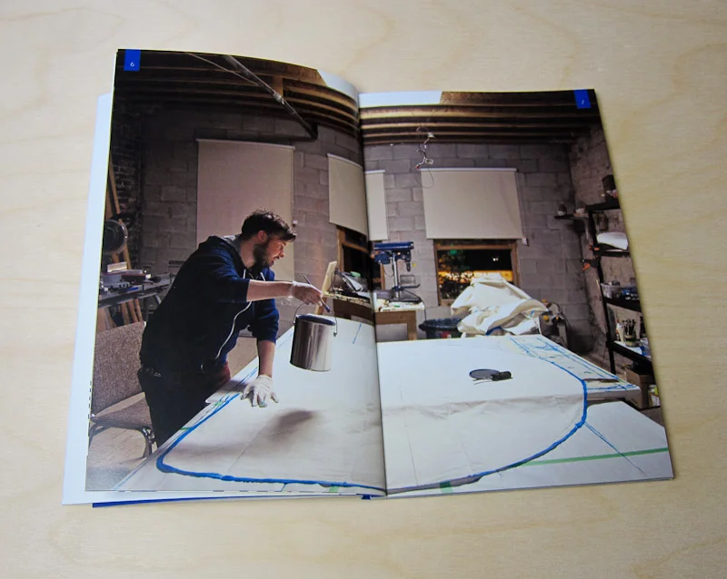
Kirkpatrick in studio - Early stages of an inflatable sculpture. Spread from Lineage Edition - Blue #1


